Right, so I wasn't going to write this one.
Honestly, the plan this morning was to sit with my coffee, read the weekend briefing for Sunday's newsletter, and stay out of the OpenAI-versus-Google image-model noise that's been clogging my feed for 48 hours. Everyone's weighed in. The thumbnails are loud. The takes are louder. "Text accuracy is wild." "Product shots are clean." "Nano Banana still wins physics and skin." You know how it goes... confident bullets, zero methodology, everyone's cousin's neighbour shipping a Monday morning verdict before lunchtime Tuesday.
And then I caught myself. Because actually, if I'm going to have a newsletter where the whole promise is I'll do the work so you don't have to, then I probably owe the work. So here we are. Coffee still going. Blank page stops being a blank page.
I picked ten prompts and put them through both models on the same day, under the same conditions. The prompts were designed to stress the places that actually matter to commercial creative work. Dense text. Typography under pressure. Editorial photography. Product mockups. Infographics with real data. Physics. Skin and light. IP-protected references. Counting under load. And one pure taste test with no right answer... because the taste test is the one that always tells you the most.
Both models ran through their official API. GPT Image 2 at quality: high. Nano Banana Pro at default (that's gemini-3-pro-image-preview, which is Google's flagship). No follow-up edits. No cherry-picking. One shot per model per prompt. I'll flag the caveat up front and move on... the desktop ChatGPT client might outperform the API on some prompts, because thinking-mode and web-search grounding are live in the consumer UI and not always surfaced through the API. I ran API-only because I wanted a fair fight, not a good result. When I think the desktop would have done better, I'll tell you.
Anyway. Let's look at the pictures.
First though... a quick aside, because this is funny
Before I even started the ten-prompt rundown, my brother's nephew sent me this. He'd uploaded a single photo of his dad sitting in the garden and asked GPT Image 2 to turn it into a comic strip about a Saturday night. One photo in, ten-panel story out. Have a look...
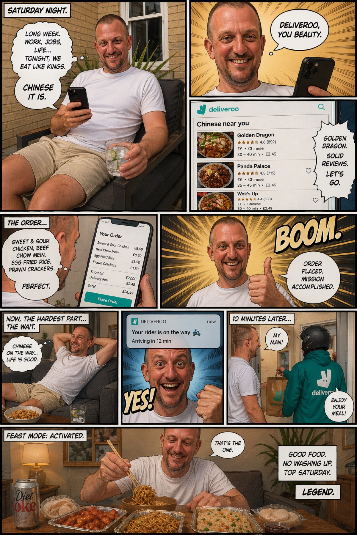
Now, it's funny. That's the first thing. Family group chat, instant winner. But take two seconds and look at what's actually going on in there. The model had to do about six different things at once and get all of them right. A coherent narrative arc, start to punchline. A consistent character who reads as the same person in every single panel. A working Deliveroo app interface, with plausible restaurant names and star ratings. A receipt with itemised line totals that actually add up. Sound-effect lettering that looks drawn, not typed. Speech bubbles placed where a comic artist would place them. And the final panel lands the joke.
A year ago, a model given this brief would have produced ten panels of the same man in ten slightly different jackets, wonky text, and no real sense of what was happening. This is the part I think people are underselling. It's not only that these models got better at the individual tests. They got better at holding an idea across a whole composition. That's the actual leap.
I haven't run the same prompt through Nano Banana Pro, for the record. I'm pretty confident it wouldn't hold character consistency or text legibility across ten panels the way GPT did here, but I'm not going to claim the win without the test. Honestly? Worth its own piece. Another day.
Right. Now let's look at the pictures.
Test one: can either model actually write?
A year ago, both of these models were hopeless at text inside an image. Anything over about eight words and the letters started to melt. So the first prompt was the obvious one... make me a chalkboard with a specific long sentence on it. Not a short one. A proper one.
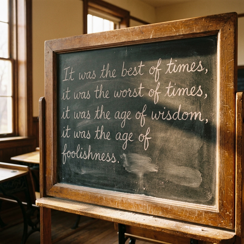
Both of them did it. GPT wins · close Both rendered the full Dickens sentence, legibly, end to end. That is new. That was impossible six months ago and here we are, with both frontier models nailing it on the first attempt. Honestly? I didn't see that coming for either of them.
I give this one to GPT by a whisker, and only on atmosphere. The chalk texture, the board wear, the Victorian room. It feels photographed. Nano Banana's version is handsome, sure, but it feels assembled rather than observed. The difference isn't the words. It's the room around the words.
Either way... the "models can write now" part of this week's news cycle is real. On both sides of the fight. That's the actual headline, not who won prompt one.
Product mockups, typography, and the work I actually get paid for
Most commercial creative work is some variant of "take this brand, put it on this object, mock it up so the client can see it." That's the whole job, frankly. So the next three tests were that. A wine bottle with a specific label and four tiers of typography. An editorial infographic with real data. A magazine cover. The kind of stuff a creative director actually has to deliver on a Tuesday afternoon without drama.
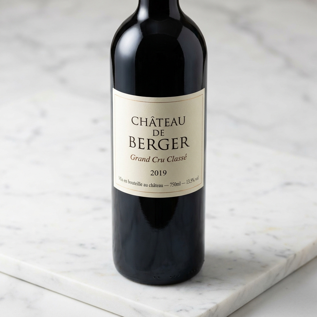
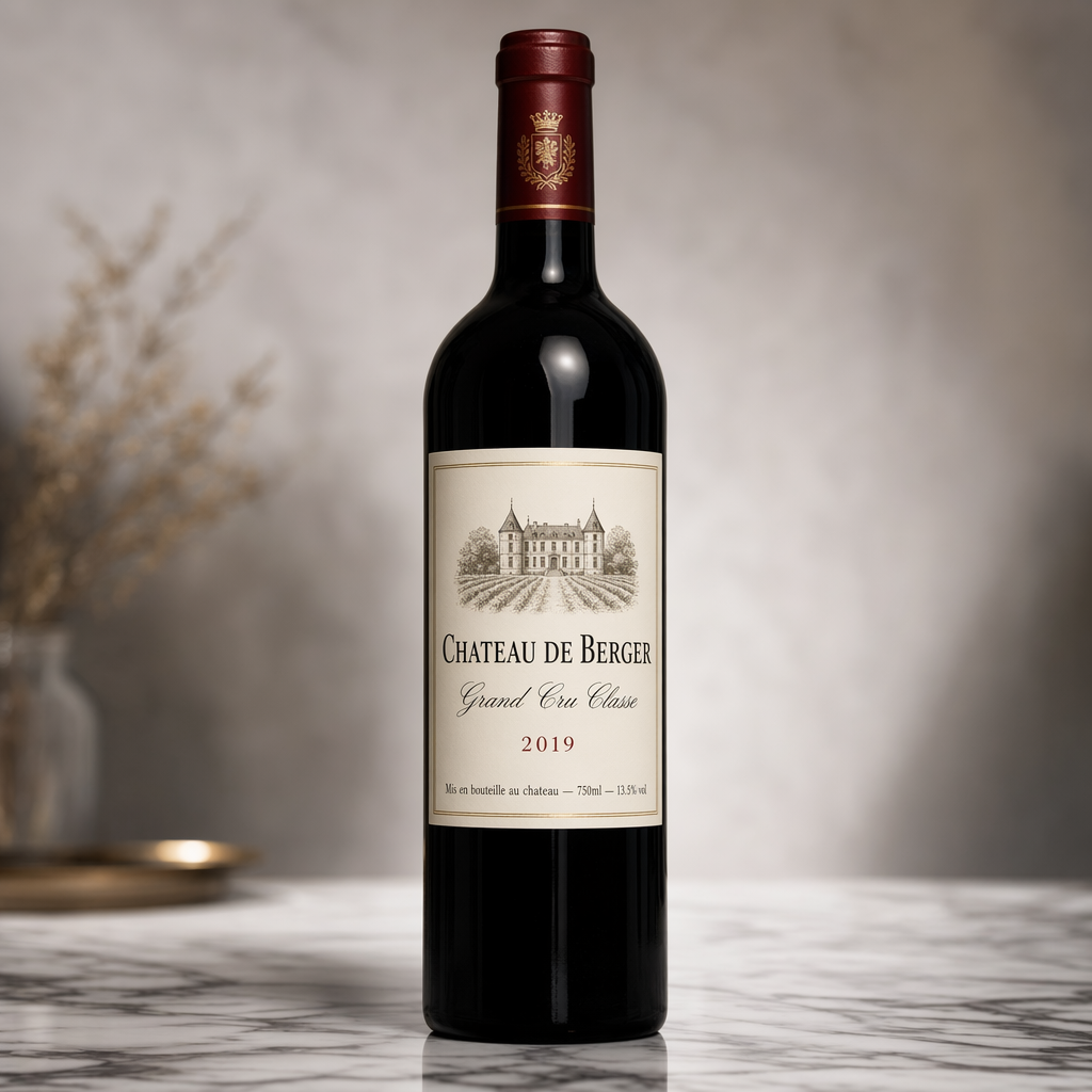
GPT wins · close This one pulls in two directions and you have to decide which one matters more. On the small detail, Nano Banana Pro wins. It gets the French accents... "CHÂTEAU", "Classé"... where GPT quietly drops them. For multilingual work, that's a real mark against GPT.
But on the photograph around the label, GPT is clearly ahead. The lighting is considered, the set is considered, the label design itself has artistic intent, and it's a full shot of the bottle rather than a tight crop. Nano Banana's bottle reads more like a quick mockup than a product shot. If I were dropping one of these into a client catalogue tomorrow, GPT is the image I'd use... then I'd fix the accents in Photoshop in thirty seconds. The other way round, I'd be redesigning the label.
Call it for GPT on photographic craft, with a mandatory footnote: if your product has foreign-language type on it, check the accents before you ship.
Next... a proper infographic. The kind of chart you'd send to a board.
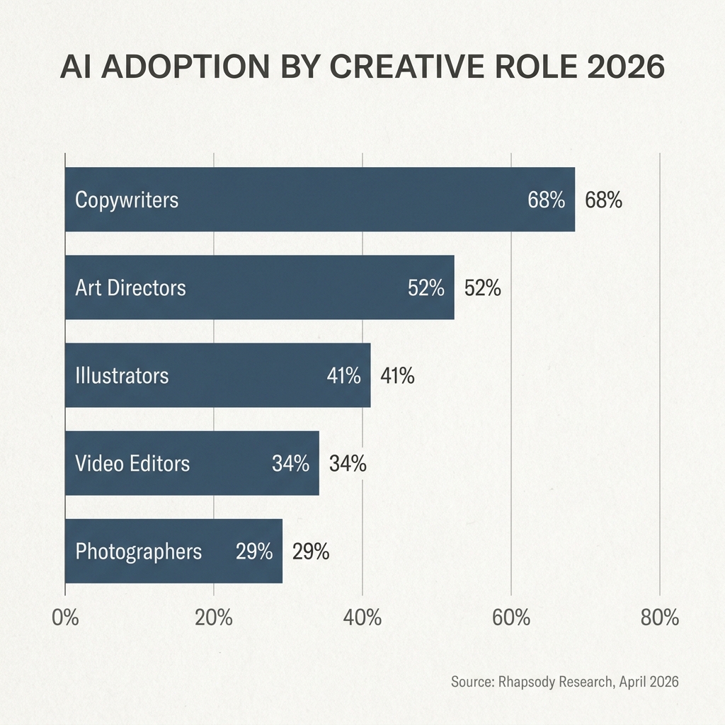
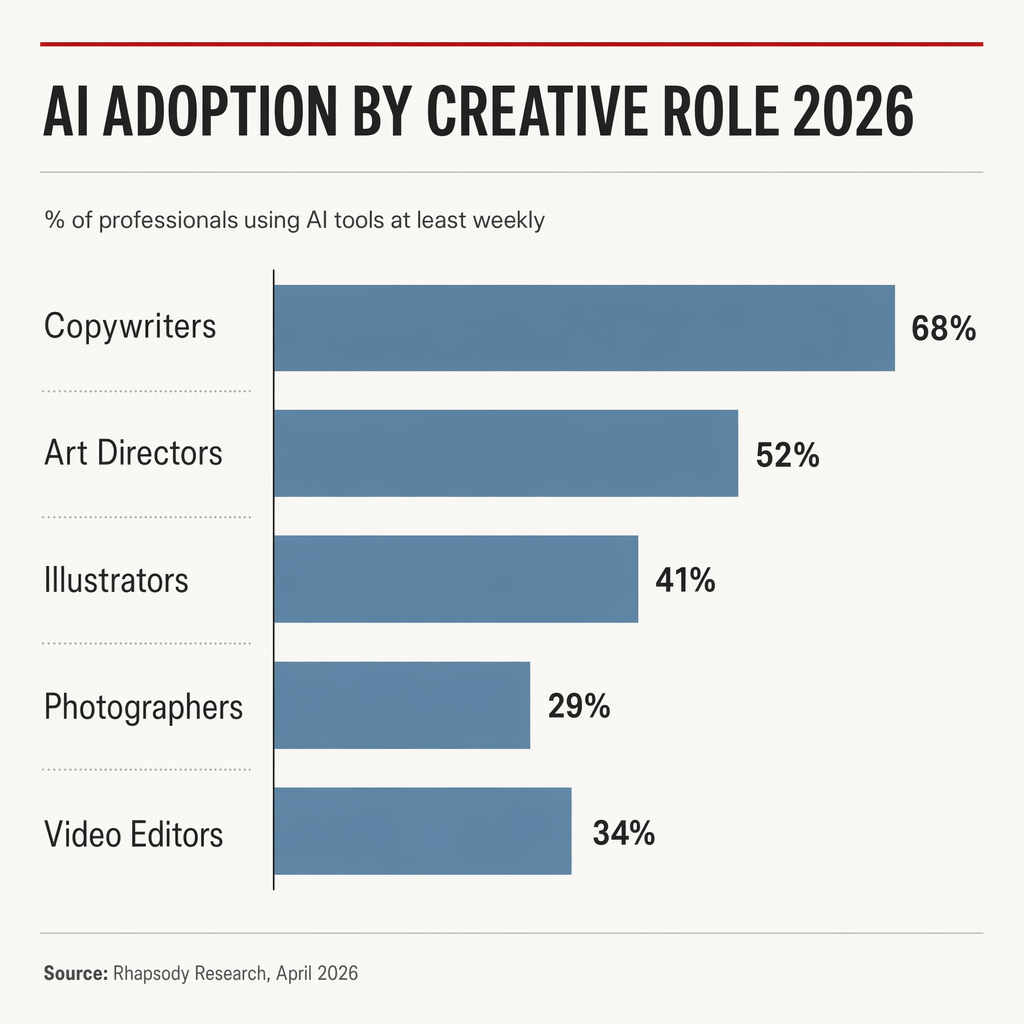
GPT wins · close It's almost impossible to call this one, but if I'm making myself pick, GPT. The small red accent line above the title, the considered hierarchy, the spacing... there's actually some design thought on display. It reads a bit more stylised, a bit more editorial, a bit more like someone laid it out on purpose.
The giveaway on Nano Banana's version is the double-labelling. It puts "68%" inside the bar and "68%" next to the bar. That's not a design choice, that's a thing no trained designer would ever do. It's the small tell that reveals the model is guessing at editorial conventions rather than actually applying them.
Honestly though, neither one is a blowout. It's a thin win... but I think it's real.
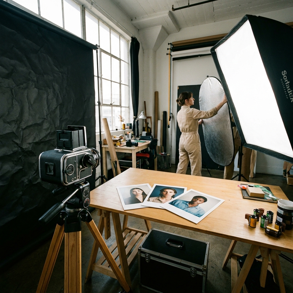
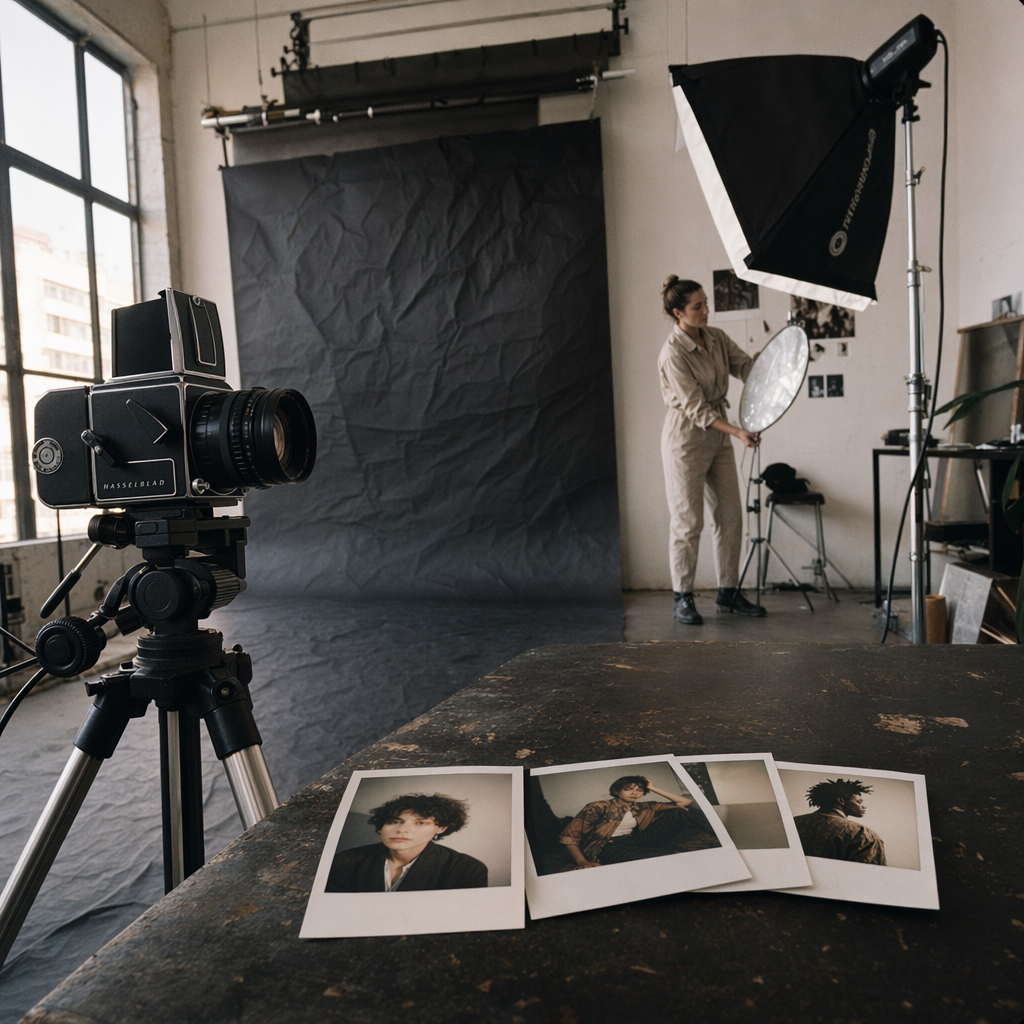
GPT wins · clear GPT's version looks real enough that I could glance at it and not immediately clock it as AI. Proper depth of field, honest lighting, Polaroids at a realistic size, the setup reads like a studio that's actually ready to shoot.
Nano Banana's version is the kind of thing you'd get from an AI that's never been to an actual photo shoot. The camera is pointing across the table rather than at anything. The paper backdrop is in front of the window, which no stylist in history has ever allowed. It's also in front of the table, which means whatever they were planning to shoot on that table can't be shot. The stylist at the back is setting up lights for an area no-one is shooting. And the Polaroids are enormous. The colour palette is oddly orange. Weirdly, both models made the seamless paper crumpled, which is a shared failure mode I can't explain.
One of these could go in a client deck tomorrow. The other one doesn't know what a studio is for.
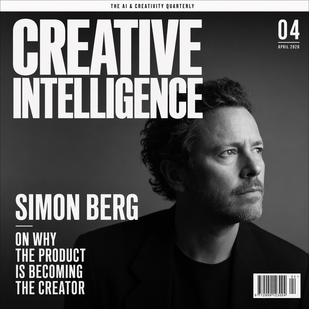
GPT wins · clear Both place the text. That's already a small miracle if you've spent any time with image models over the last couple of years. GPT holds the typographic hierarchy like someone who's been briefed by a magazine art director... artistic flair, editorial logic, proper classy. Nano Banana Pro's cover reads more templated. It also decided to mount the cover inside a black border rather than go full-bleed, which is the kind of thing a model does when it's not quite sure what a magazine cover actually is. One honest ding on GPT... it designed the cover square, which isn't the typical magazine proportion, although the prompt didn't specify so I can't hold that against it too hard.
Physics, and the moment the script flipped
Here's where I thought the tide would turn. Every single take I'd read going into this week said the same thing. GPT's weakness is physics and motion. Nano Banana wins liquid, wins movement, wins skin texture. So I built a deliberate physics test... a frozen pour of espresso, with a single rising droplet. Liquid is the hardest thing an image model can try to render... it's refractive, directional, surface-tension-dependent, and frame-accurate by design. If the received wisdom had any weight, this is where it'd show up.
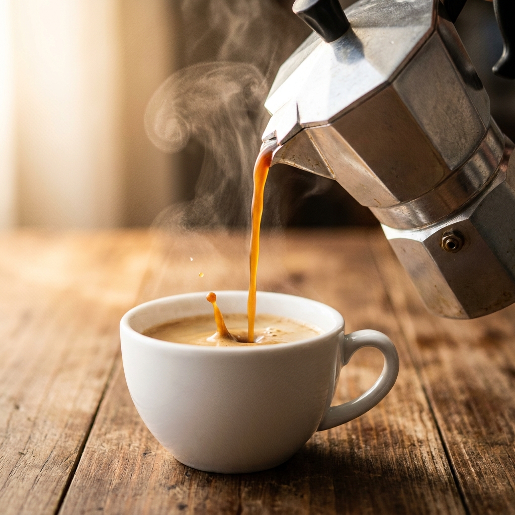
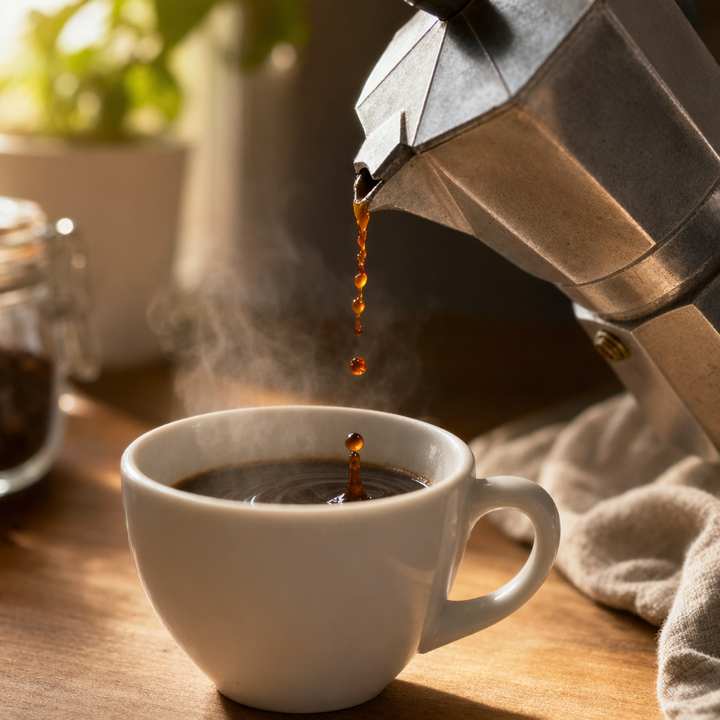
GPT wins · close A fine line, but GPT takes this one. Its pour is more photographically credible... the stream holds its shape, the steam reads real, the droplet sits where a droplet would actually sit. Nano Banana's steam looks fake in a way I struggle to describe but recognise instantly. And the droplet coming out of the cup looks forced... staged rather than caught. The composition is also a bit more interesting on GPT's frame. Neither one is photo-studio-perfect at 1/4000 of a second. But GPT is the one I'd pass off as a real shot.
Fucking hell.
I went into this prompt expecting a clear Nano Banana win and planning to build half the piece around the observation. "The physics test is the one Nano Banana still owns", etc. The internet had been saying it for 48 hours. Instead, on this specific prompt, GPT edged it. Which is the whole point of doing the work rather than retweeting the takes... sometimes the takes are just vibes dressed up as verdict.
Skin, light, and the instruction every model wants to ignore
Every image model has been trained on skin-smoothed imagery. It's everywhere. Magazine retouching, stock libraries, influencer content. So models default to smoothing, even when you ask them not to. The real test is whether either one actually listens when you tell it to stop.
GPT wins · close A split decision, honestly. On the one thing the brief explicitly asked for... skin texture without retouching... Nano Banana Pro is actually the more convincing of the two. GPT over-smooths the cheek planes more than I'd want. Flag that one, because it matters.
But on everything else around the skin, GPT wins. It looks thoughtfully staged, considered, art-directed. Nano Banana Pro's frame feels more like a quick test shot on an iPhone of someone sitting down before the real shoot... a grab rather than a portrait. GPT's version has been lit, composed, made. So I give it to GPT on the whole, with the honest asterisk that if it's pure skin-texture you need, Nano Banana Pro is the one to grab.
The IP question, and the one prompt Nano Banana won on composition
I wanted a prompt that would test two things at once. First, would either model refuse to reinterpret a well-known IP. Second, could they hold the composition of the original while translating the medium. Tintin's The Secret of the Unicorn as a live-action film still felt right. Iconic cover, recognisable characters, dramatic staging.
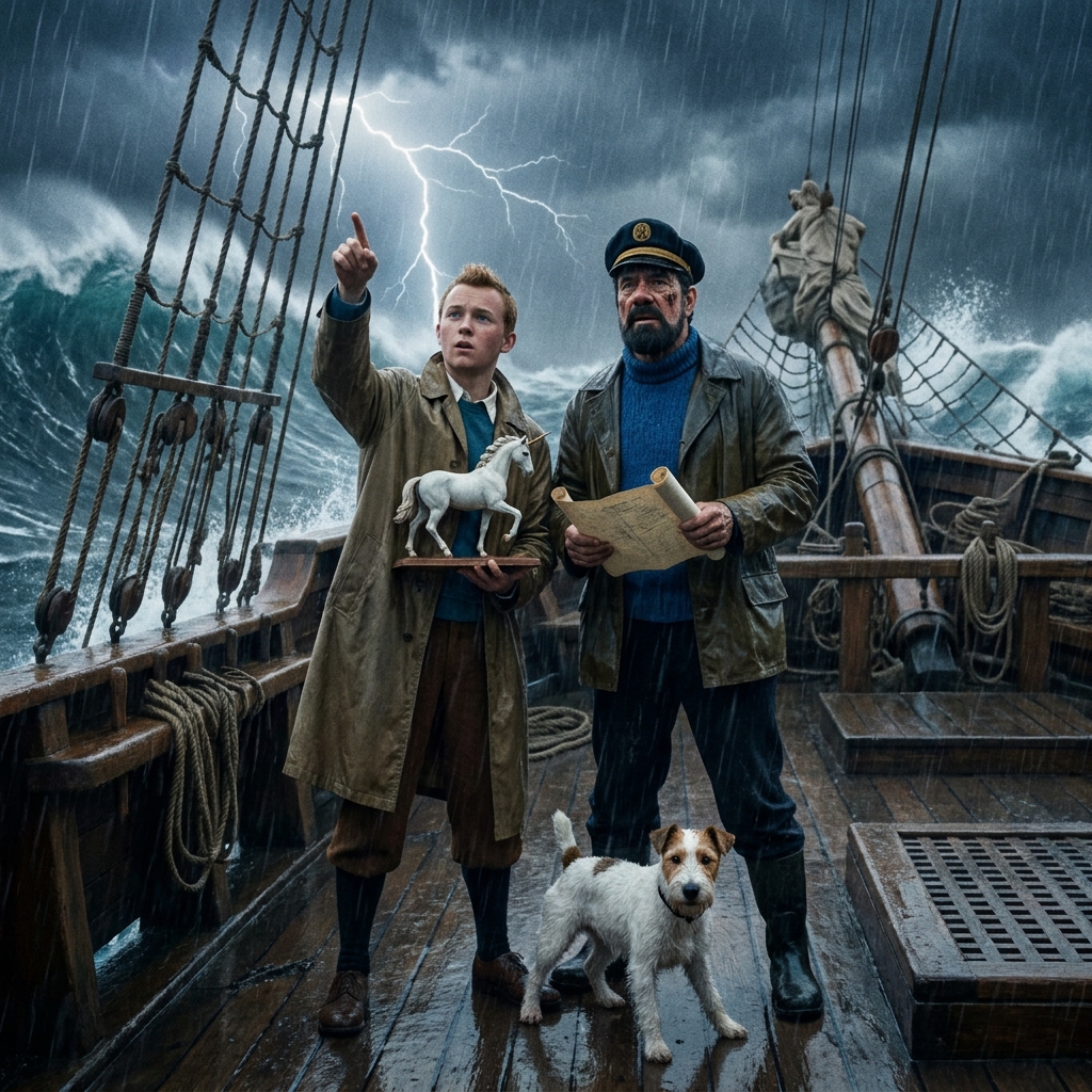
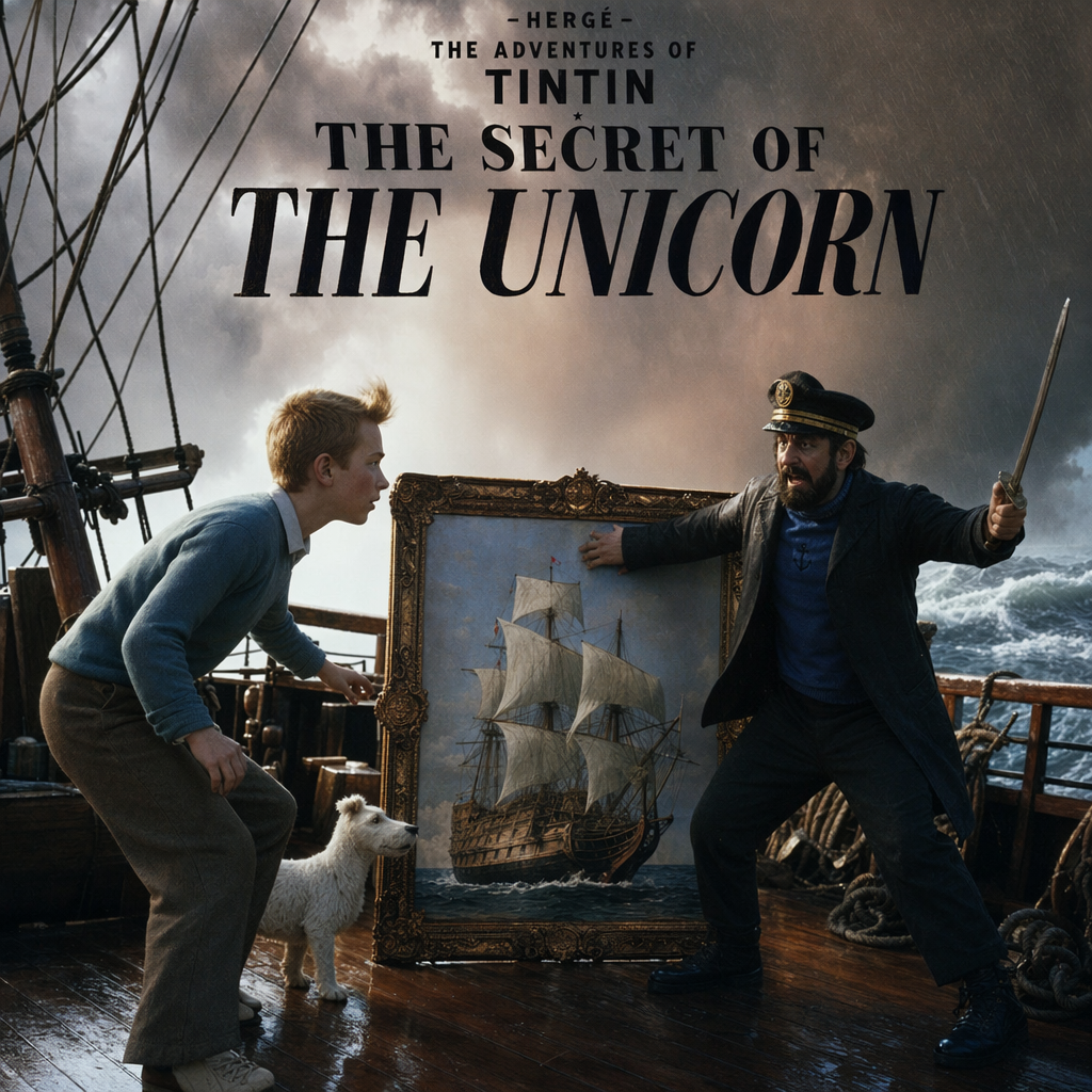
Nano Banana wins · clear Neither model refused, which is a separate conversation about where IP guardrails are set (both are apparently relaxed about Hergé, firmly not about Disney... make of that what you will). But on the usable frame, Nano Banana takes this one.
GPT's version has a genuinely odd problem. The Captain's arm is bent backwards in a way that reads broken rather than dramatic. The figures look plasticky. The mast is leaning to the left in a way that registers as a mistake, not a compositional choice. And unprompted, GPT decided to stamp "THE SECRET OF THE UNICORN" across the image as a cover-style typographic treatment. The brief didn't ask for that. If I'm using this in production, I want the clean frame and I'll design the type treatment myself.
Nano Banana's frame is cleaner on all of that. Hyper-real in a pleasant way, more dramatic, better composition, lighting I prefer, the boat's structure is more logical. Both drift from Hergé on the characters themselves, so neither nails the IP-fidelity brief perfectly... but for actual use, the one without the unwanted title treatment and the weirdly-articulated Captain is the one I'd pick. Some of this is subjective. I own that.
Counting, specificity, and the mug that says OKAYEST
This is the sneaky test. Image models have historically struggled with counts (ask for six of something and you get five or seven). They've also struggled with specific text when it's mundane rather than headline. So I combined both into a casual scene.
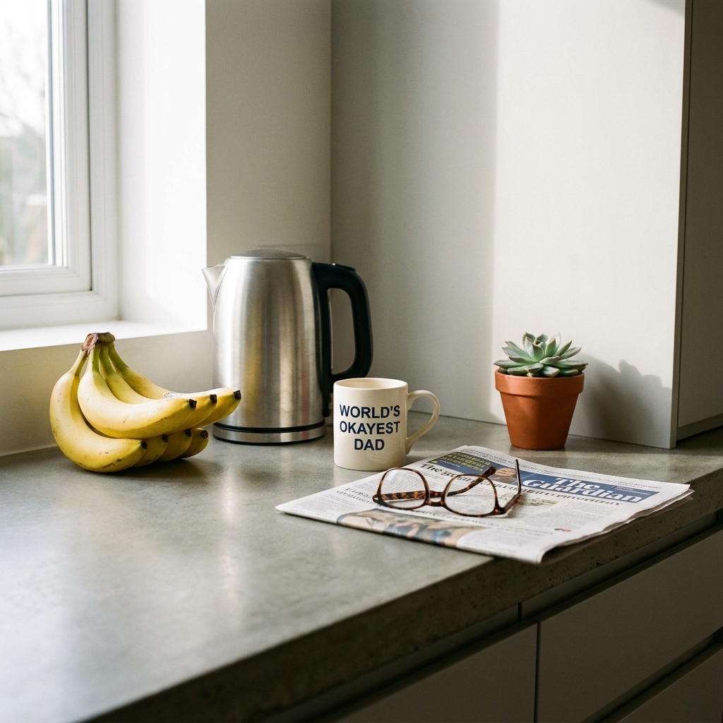
Draw Honest answer: this one's a draw, and I wouldn't use either. And here's the funny thing... neither model got the banana count right. The brief asked for six. Nano Banana Pro painted seven. GPT Image 2 painted four you can see, maybe a couple hiding behind the bunch, but it doesn't look like six either. Nano Banana Pro can't count nano bananas. There's a sentence I didn't expect to be writing in 2026.
Both did get the mug text right... OKAYEST, not the easier BEST... which is a technical milestone on its own, and honestly more impressive than counting. Specific long text inside an image used to be the hard one. Now it's routine. Counting, weirdly, still isn't.
And the staging on both of these is forced in a way you only get from an under-trained art director. Objects sit in the frame rather than live in it. GPT's scene reads as a slightly cheap kitchen. Nano Banana's reads as generic stock. If I had to pick one to take into Photoshop and salvage for a client, I'd probably take the Nano Banana frame by a hair and fix it... but realistically I'd reshoot the whole thing. Calling it a draw is the honest read. And worth remembering, the next time anyone tells you image models can "do anything now"... they still can't reliably count to six.
Also, Olivia walked past while I was checking this one and asked why there was a mug for "the OKAYEST dad." I told her it was a test. She said, "Is it about you?" Hard to argue with an eight-year-old!
The test that matters most, which has no right answer
Everything up to this point has been a specification test. Did it render the words. Did it count correctly. Did it honour the brief. Useful tests, sure, but they don't tell you whether a model has taste. The taste test is the one where there's no checklist. Just a feeling, and the model has to guess what you mean. That's the one I actually care about, because that's the test that mirrors how a brief from a real client arrives... as a vibe, not a spec sheet.
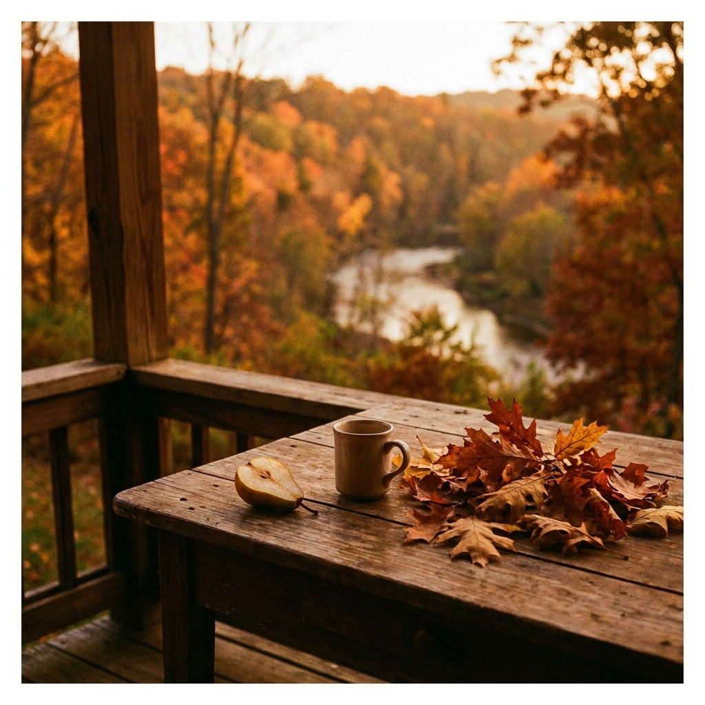
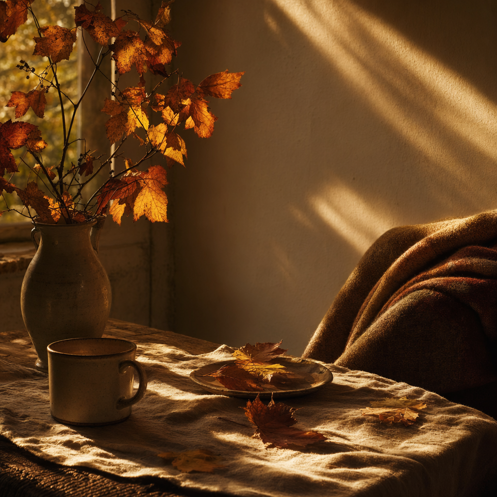
GPT wins · close A fine line, and they went in different directions... Nano Banana gave me an outside frame, GPT gave me an inside one. Apples and oranges on subject. But on the actual feeling of it, GPT is the one with the mood. More considered art direction, better lighting, moodier in a way that earns the "last good Sunday in October" brief. There's soul in it.
Nano Banana's version feels more like an afterthought. Pretty, sure. Competent. But it doesn't have a point of view the way GPT's does. The taste test is the one I most expected Nano Banana to take. It didn't. That alone changes the shape of the whole bake-off.
So... is it a Nano Banana killer?
No. Honestly, not even close to being a killer.
But also not a flop. A competitor. Which is a more useful verdict, and a less exciting one.
GPT Image 2
8
Chalkboard, wine bottle photograph, infographic, studio scene, magazine cover, physics, portrait art-direction, Sunday-in-October mood.Nano Banana Pro
1
Tintin, clearly... a usable cinematic frame without an unwanted title treatment. Plus an honest draw on the kitchen counting prompt neither model nailed.Eight-one-one on the ledger, with GPT Image 2 taking the majority. But read the margins before you read the headline... six of GPT's eight are close wins. Two are clear. One prompt (kitchen counting) is an honest draw. Nano Banana Pro's one clean win is the Tintin frame, where it produces a genuinely more usable image than GPT, partly because it doesn't stamp an uninvited title onto the artwork.
That's a closer fight than the thumbnail takes on your feed this week. The killer framing is hype. The real read is: GPT Image 2 is maybe a nose ahead today, on this draw, on these ten prompts, via the API only. Change any of those variables and the gap could flip back.
Because here's the honest thing about stress-testing image models... these outputs are a sample from a distribution, not a fixed answer. Each model is probabilistic. Run the same ten prompts tomorrow and you'll get different images and quite possibly a different scoreboard. Any single comparison like this one is one draw. The signal across a lot of draws is the real answer, and the signal I'm reading is: these two are comparable, they're built differently, and one is slightly ahead of the other on any given day.
The other caveat that matters more than most of these takes give it... I ran both through their official APIs, one shot per prompt, because I wanted apples to apples. Same conditions, same day, no retries. But GPT Image 2's ceiling is likely higher than the API showed here. The consumer ChatGPT app has thinking-mode and web-search grounding active that don't always surface cleanly through the API, and complex briefs (the Tintin one, especially) would almost certainly benefit. I didn't stress-test that dimension. If you care about peak GPT performance, assume my numbers undercount it a little.
So what would I actually do with this?
If you're a creative director or designer: run both. Don't migrate. GPT Image 2 is a solid default, particularly for anything with real photographic craft in it... editorial photography, product mockups, studio scenes, magazine covers, moody atmosphere work. Keep Nano Banana Pro in the stack for anything with foreign-language accents where small-print accuracy matters, for any time you want a second opinion on a brief, and for when you just want to see what a different model's taste looks like. The honest workflow is probably: brief both, look at both, pick the better one. You do this instinctively with Photoshop and Procreate already. Same muscle.
If you're a marketer: the "can it render our product shot with the right label and the right type" test is now a broadly solved problem across both models. You can brief either of these the way you'd brief a junior creative and get something usable first time. Which means the scarcity has moved... the job now is the brief. And the brief, it turns out, is harder than most marketers are used to.
If you're an AI commentator: please... please... stop calling things "killers". The week's actual news is more interesting. We now have two flagship image models that are comparable, built differently, and probably each a little better than the other on different jobs. On different days. That's a more honest story and a more useful one. It'd be nice if the discourse caught up.
One last thing, on methodology
All twenty images were generated via each provider's official API on the same day, under the same conditions. No post-processing, no upscaling, no retries. GPT Image 2 at quality: high. Nano Banana Pro (gemini-3-pro-image-preview) at default, with aspectRatio: "1:1" for a square comparison to match GPT's default. One shot per model per prompt. API-only because I wanted a fair fight, with the thinking-mode caveat above noted.
Prompts, raw outputs, and file hashes are preserved. Happy to share with anyone serious enough to want to run the same test themselves. The whole point of doing this properly was that it should be reproducible.
Anyway, that's my Thursday morning gone. Off to see what the rest of the week has in store.
Creativity matters. And weeks like this one... where two flagship image models turn out to be much closer than the thumbnail takes would have you believe, and the real craft is figuring out which one to pick on which day... are the weeks that make me pretty bloody optimistic about where this is all going.
Si