Right, so I'm going to do this properly.
It's Wednesday afternoon, I've got Granola running, a screen recorder catching everything I do, and I've just opened Claude Design for the first time with an actual plan. Well, not a plan exactly. More like an hour or so of curiosity with the intent to stress-test the thing rather than hunt for a hot take.
I'll be honest with you: I've been putting this off. Anthropic shipped Claude Design last Thursday and the whole creative corner of the internet lit up. Canva is dead. Figma is dead. The end of the designer as we know her. All of it. And every time I've thought about writing my own view on it, I've hesitated. Partly because it's too easy to write the takes with ten minutes of poking around. Partly because, if I'm really honest, I'm not sure anyone actually wants my view specifically.
Then I caught myself. Which is stupid. Because actually... I probably am one of the small handful of people who owes this a proper, considered response. So here we go.
A quick word on why I'm the right person to be writing this, and why I'm going to mostly stop talking about that after this paragraph, because VOICE.md tells me not to bang on about it. I ran an ad agency in my twenties, sold it, and then spent the next fourteen years building Ceros. Ceros is a creative tool. Thousands of designers and marketers use it every day to make the kind of interactive digital experiences that would otherwise require a developer, a designer, a project manager, and six weeks. So: I have opinions on creative software. More specifically, I spent two years before I left Ceros building a product called Gemma.ai that was, and this part matters, essentially trying to be what Claude Design is. It didn't ship. I also wrote a strategy document for the Ceros board on my way out, called When the Product Becomes the Creator, which was my attempt at explaining where all of this was going. I published it this week. It reads like a table of contents for Anthropic's announcement.
So I have skin in this game. Emotional, intellectual, all of it.
Anyway. Let's get into it.
The bit that matters before the bit that matters
There's a thing I believe about creativity that I've been saying, in various ways, for most of my working life. The human desire to have an idea and want to manifest it hasn't gone anywhere. It isn't going anywhere. What's changing is the distance between the idea and the thing.
That distance has been collapsing for three years and it keeps collapsing. The interesting ones watching it happen are not the people writing obituaries for design software. They're the people asking what gets made now that didn't get made before.
Used to be, to make most interesting things, you needed money, time, and a team. That meant a lot of ideas died in people's heads, because a venture capitalist wasn't going to back them and no one was going to work for free for six months. What Claude Design is, at its honest best, is Anthropic's attempt to give that team in a box to a broader slice of the market. Mid-market companies. Some enterprise. Founders. Marketing leaders. Creative directors. People with ideas, fewer resources, and now some very interesting help.
That's a good thing. I know people get bristly about that framing. I don't care. More creativity in the world is good. More people being able to manifest the thing in their head is good. We can debate the second-order effects all day. We can. But please don't let the debate obscure the first-order truth.
Creativity matters. The world needs more of it. And we are finally getting the tools.
Right. Product review.
Canva meets Adobe meets vibe coding
If you want the whole thing in one line, that's it. Canva meets Adobe meets vibe coding.
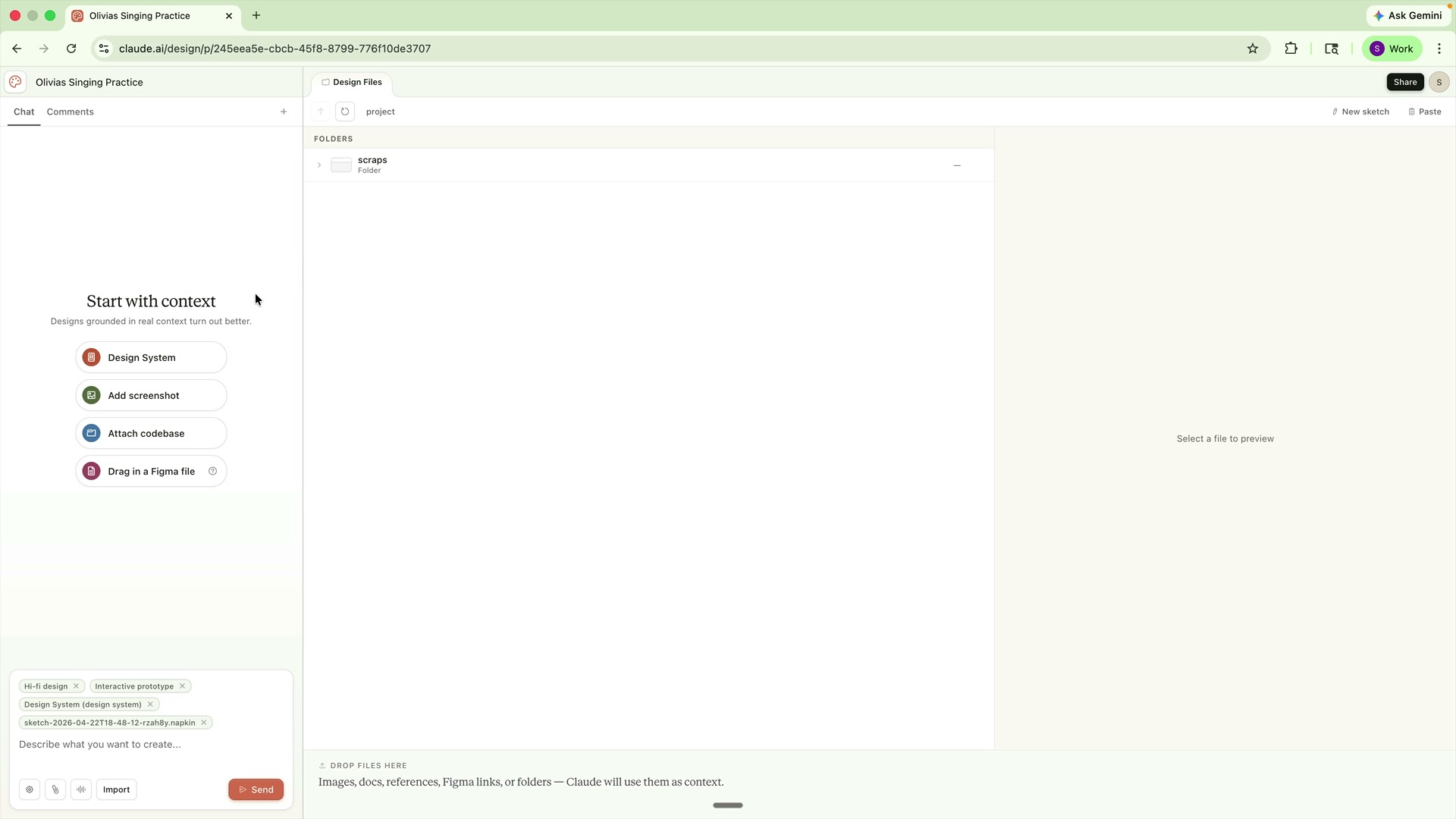
Claude Design sits as a tab inside the Claude app. You land on it and you get a few starting points: Prototype, Slide deck, From Template, Other. A little bit of shaping to stop you staring at a blank canvas, which is the single most common failure point for any creative tool. Below that there's an Examples section, which is part inspiration, part education (two of the three things I think any creative tool has to do, by the way... inspire, educate, empower). Then there's Design Systems, which is where the real magic happens. I'll come back to that.
You can start a project from a prompt, a sketch, a screenshot, a Figma file, or a GitHub repo. There's a toggle between Wireframe and High Fidelity, which is thoughtful. You can link a design system to it, or let it make you one.
Test one: Olivia's singing practice sheet
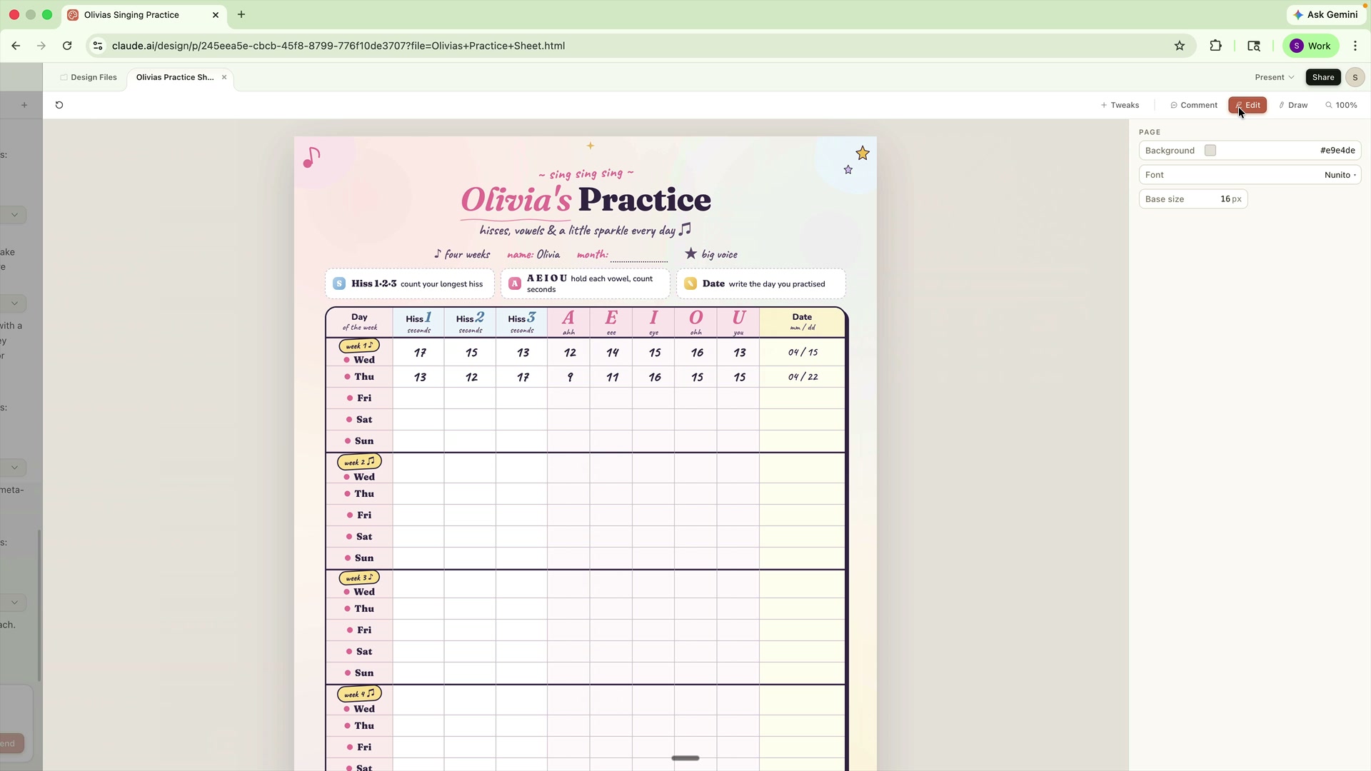
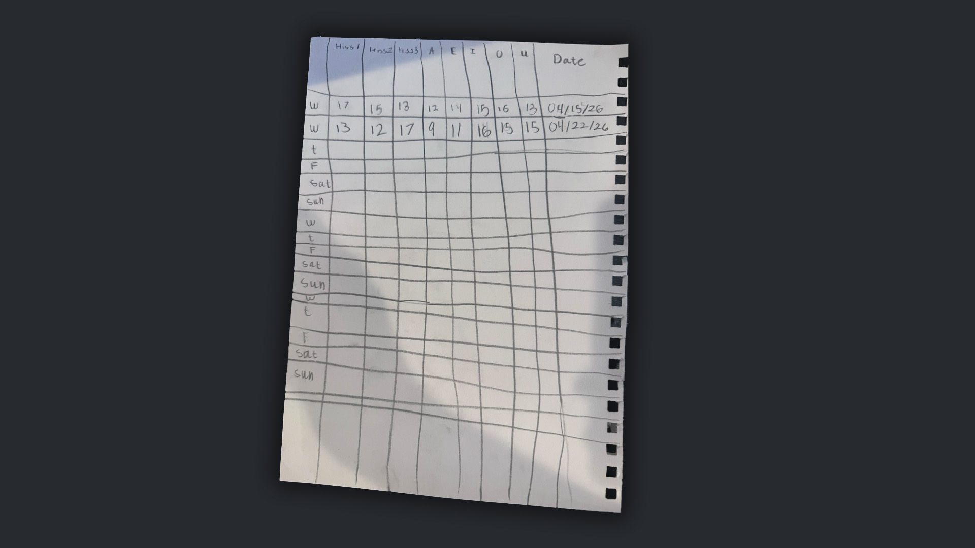
My daughter is nine and she's learning to sing. She made herself a little grid on a piece of paper to track her daily practices... humming scales, vowel work, the classic AEIOU. I took a photo of the grid. I wanted to turn it into a fun, printable A4 version she'd actually enjoy using. Something I could print out, stick on the fridge, surprise her with when she gets home from school.
I upload the photo. I give Claude Design a voice-transcribed prompt... I don't really type anymore, for what it's worth, I'm borderline dyslexic and the path from thought to spoken word is so much shorter than thought to grammar-spelling-arm movement that it genuinely makes me more creative. Anyway. The prompt: "Here's a practice sheet my nine-year-old daughter made for her singing lessons. Can you design me a really beautiful version of it, speaks to the fact that she's learning to sing, one page, A4 or letter."
No design system. No brand. Just the photo and the brief.
Claude thinks. It considers aesthetics. It sets the columns. It makes a first pass. And...
Honestly? Wow.
The first pass bleeds off the bottom of the page, which it notices on its own. Without me asking, it re-iterates. And re-iterates again. It catches the overflow, it fixes the layout, it dials in the type. It's effectively stress-testing itself visually, which I tried to get my product team to do at Ceros a few times. It's the right instinct.
The output is genuinely good. Soft colour palette, playful musical iconography, the right information architecture, properly print-ready. Twenty minutes before, Olivia's practice sheet was a photo in my camera roll. Now it's a polished, on-brand thing I could print and stick on the fridge. Actually... hold on. I did need to print it, because my wife was about to pick Olivia up from school and had asked me to have it ready.
Cue the greatest irony of my afternoon. The AI built me a designer-looking singing practice sheet from a photograph in under a minute. Then I spent twenty minutes fighting my printer. No joke! Paused the recording. Solved the printer. Came back. This is the future we live in, folks.
That's the vibe of the whole review, by the way. Impressive output. Occasional stupid friction that has nothing to do with the tool and everything to do with the stack around it.
Where it gets frustrating
So I get cocky after Olivia's sheet works, and I try to actually edit the design.
The text, I can edit. I click on a word, I type, it updates. Fine. Slick. What I can't do... and this is where my creative director instincts flare up... is pick up the microphone illustration and move it two inches to the right. I can ask Claude to do it with a prompt. I can leave a comment, which Claude interprets as a prompt. But I cannot grab the thing and just put it where I want it.
This is the edit problem, and it's the single most interesting unsolved problem in AI-first creative tools.
Because here's the thing. Users, particularly designers but also marketers and founders and anyone else who's been close to the making of something, get to a moment. They've been prompting. The AI has got them 80% of the way there. And then they want to say: right, stop briefing me, just let me drive for a minute. Self-driving turned off, self-driving turned on. It's the feeling of being handed the Keynote file after your designer made the deck. You want the keys.
The industry's default answer, the Figma-shaped answer, is to give you a full-fat design suite waiting on the other side of the generation. And look, that's Ceros's answer too, more or less, which is genuinely interesting and why they're still in an interesting seat. But it also creates an ugly tension. If you have infinite creative possibilities (which is what generative tools promise), you can't have a fixed traditional design suite waiting, because the surface area of what you might need to edit is genuinely infinite. Palette pickers. Sliders. Ruler-assisted alignment. A thousand interactions that were built over thirty years for specific expected outputs. It gets unwieldy, fast.
The answer I've been positing since about 2023, and which I know with some confidence is the right answer because we explored exactly this with Gemma, is different.
You manifest the interface on demand.
If the user creates a cluster of orbs floating around on a page and wants to tweak their positions, they don't need a full design suite. They need a tiny, bespoke, throwaway interface that does exactly that one thing. Colours, spacing, layout of those orbs. Generated for that moment, used, and dismissed. The next generation, the next interface. The model already has context on the thing. The model already has UX patterns in its training data. There's nothing stopping it from spinning up a surgical mini-UI for every specific editing job. Nothing except compute time and model accuracy, both of which are getting better every quarter.
The UI manifests when the user wants it, where they want it, for exactly as long as they need it.
That's the bet. If anyone at Anthropic is reading this, that's where I'd push next. The comment-as-prompt pattern Claude Design uses is a step in that direction, but it's still brief-shaped. The next step is interface-shaped.
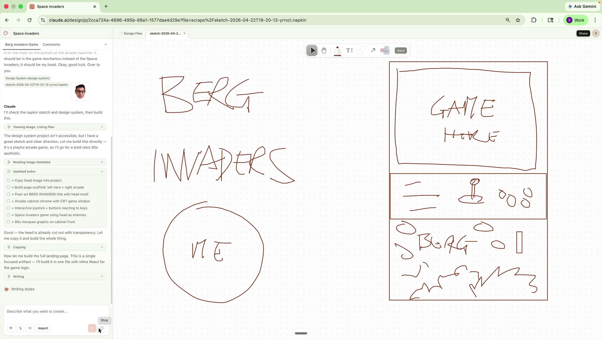
Test two: the design system
This is where Claude Design actually made me go "holy shit."
I asked it to build a design system for Simon Berg, my personal brand. I pointed it at my GitHub repo (which I had to fumble through making public and then private again, because I'm not a developer at heart and the Settings panel made me feel about fifteen). I dropped in my logo files, my LinkedIn banner, a few photos.
Then I hit Continue.
And it goes away and builds me a properly considered design system. Not a moodboard. Not a vibe check. A system. A UI kit. Hero display styles. Buttons. Pull quotes. Radius, shadow, spacing. Button states, button variants, button sizes. All live, all generated from my actual materials!
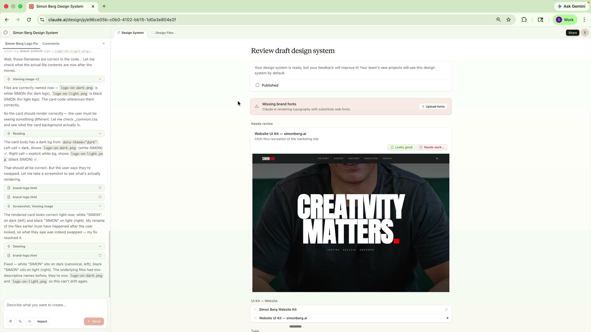
I had one real correction. It swapped the light-on-dark and dark-on-light logo variants. I told it so in plain English. It fixed both in the next generation and asked me to confirm.
This is the single strongest feature I saw all afternoon. My co-founder on my brand site, my friend Thomas Kleist, has been building something conceptually similar for a client project and I can't help but notice the overlap. What's shocking is not that Claude Design builds UI kits. Figma and Adobe have had tooling for this forever. What's shocking is that it does it from the actual brand context, interactively, and hands you a working published system at the end... not a PDF, not a style guide, not a Notion doc, but an actual generated kit you can then point new projects at, and those new projects inherit it natively.
So my next test, naturally, was to ask it to build a slide deck in my design system. The subject: my own talk on creativity and AI, which I've given a few times, and which lives as an 87-slide Keynote stuck somewhere in my Dropbox. I exported it to PDF, fed it in as context, and off Claude went.
What came back was an 87-slide, on-brand, narrative-aware deck. Not a perfect deck, not an exact replica. The narrative's off in places because my original deck was a talk deck, meaning most of the story lives in the words I say while showing each slide, and Claude doesn't know those words. Visually though? Solidly on-brand. Animations were added where they made sense. Colour palette right. Type stack right.
It also, to its credit, visually verified its own output slide by slide. Opened each slide, looked at it, iterated if something was off. That was something I'd suggested to the folks at Bolt and at Macaly months ago. Glad to see someone shipping it.
This is the stuff that reviewers who spent ten minutes with the product are missing. The deck output isn't the revelation. The self-visual-verification is.
Test three: Berg Invaders, and a head-to-head
I also built, for no reason other than curiosity, a landing page for a fictional Space Invaders clone called Berg Invaders. It has me as the protagonist, an arcade cabinet, a working joystick tied to keyboard input, and my head as the alien. I built it in Claude Design, Bolt, and Macaly, with the same prompt, at the same time, so I could compare.
Claude Design won. Fairly comfortably. The output had better pixel art, better game logic, better arcade-cabinet framing, and a more complete experience. Bolt's version was functional but visually weak. Macaly's version, credit where it's due because their CEO Peter jumped in personally on my live build after noticing it had crashed, eventually came together nicely... better than Bolt, not as good as Claude. What a time to be alive!
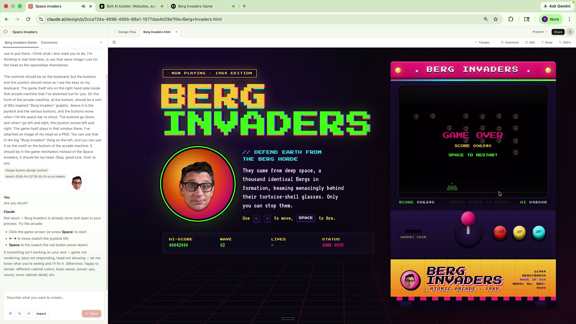
What I take from that, beyond "Claude Design wins this particular bake-off," is something more interesting. Claude's visible advantage was that it held the creative intent longer. Bolt and Macaly are both vibe-coding tools with creative outputs. Claude Design is a creative tool with vibe-coding underneath. The framing matters more than the feature set.
One honest caveat before I move on. Parts of the Claude Design experience feel unfinished around the edges. Nothing dramatic... edit controls that don't quite land where your instinct expects them, a couple of moments where I wasn't sure what the product was doing, share and export flows that made me click more than I wanted to. None of that undermines the core, and I'd bet most of it gets polished out in the next few releases. It's a research preview. I'd be more worried if it felt too finished this early.
The token problem, which is actually a compute problem
Here's the thing I don't see anyone writing about clearly.
I didn't hit the token wall myself in this session, but plenty of friends and colleagues have, and the online reaction has centred on the same complaint: the product is genuinely impressive, and then you run out of tokens in half a day.
The received wisdom is that Anthropic is cost-conscious, which, sure, obviously. But I think there's a more interesting explanation sitting underneath that. Claude Design runs on Opus 4.7. Opus is Anthropic's flagship and compute-heaviest model. Anthropic has been battling compute-supply constraints for over a year... it's one of the quiet stories of 2026. It's bigger than protecting margins. I think they're actively reserving compute. Not letting users buy more tokens isn't a pricing decision, it's a rationing decision. And that's a very different signal.
Which brings me to the thing I've been wanting to say all week.
Token discipline has become a real skill. That's true and it's good. The waste in most AI workflows right now is embarrassing. Raw PDFs dumped into context, 50-turn conversations that resubmit themselves on every message, Opus used to proofread emails, sloppy context-loading by default. All fixable. All worth fixing.
But here's the careful bit. In the rush to become token-efficient, there's an equal and opposite risk: becoming intelligence-deficient. You don't notice the moment your context gets too thin, just like you don't notice the moment your ideas got too pedestrian. You sit there feeling smug about your clean prompt rail and the outputs look fine and you assume everything's good, but the thing you lost wasn't tokens. It was the wander. The meander. The three-tangent conversation where the interesting idea landed in minute eleven.
We are about to spend the next couple of years working this out. People who internalise only the efficiency lesson will miss half the point. People who just burn compute and complain when it runs out will miss the other half. The good news is that if you care about this at all, you're already ahead.
So: is Claude Design the end of Figma?
No.
Is it the end of Canva?
Also no. If anything, Canva's $40bn positioning alongside the launch, as an export target inside the same conversational surface, is one of the most interesting strategic plays in the software industry this year. That's not a company that thinks it's dying. That's a company that just worked out how to stay useful when the interaction model moved.
Is Claude Design the most important shipping proof that the interaction model has moved? Yes. Plainly.
The strategy document I wrote for my company in April 2025 argued that the product was becoming the creator. That the creative tool was no longer a canvas you opened on a Mac but a conversational surface you talked to, inside the same tool where you planned and wrote and coded. That's what Claude Design is.
Gemma was trying to be this two and a half years ago. We got shut down before we could land it. Anthropic, with better models, better infrastructure, and the benefit of two years of public AI development, has now done it. Not perfectly. Not cheaply. But done, shipped, available, and in the hands of anyone with a Pro account or above. That's a significant moment and I think the industry should sit with it for a minute before rushing to file the usual "X is dead" takes.
What this means if you make things for a living
A few honest thoughts.
If you're a designer: don't panic, but don't sit still. The stuff Claude Design does well (rapid generation, on-brand system application, presentation-layer output) is exactly the stuff that used to take days and that clients assume takes days. Your rate card is about to get interesting. The higher-order work (taste, judgement, knowing what to make and why, knowing what to cut, knowing what to skip entirely) is getting more valuable, not less. Get very good at that part.
If you're a creative director: good news, this is your moment. The thing you've always been paid for... knowing what to build... becomes the scarcest thing in the stack as execution gets free. Bad news is the same news. You don't get to hide in management anymore. You have to have a point of view.
If you're a founder or marketing leader: make the time to actually play with Claude Design. Not a ten-minute poke. An hour, on a real project, with a real output you can show to someone. Without that you're just reading commentary about other people's reviews. Everyone you're going to compete with in the next year will have done this.
If you're a developer: I know, I know, this article wasn't for you. But pay attention to the design-system-from-repo flow. The primitives under it are the same primitives under the coding agents already in your editor. The future where your agent reads your repo, generates the UI, ships the design system, and hands you back the component code is not five years away. It's in beta. It's called Claude Design.
One last thing
This is the biggest move in creative software I've seen in years. And I'm saying that as someone who spent fourteen years trying to build a better version of what came before it.
It isn't the end of anything. It's a beginning of something.
Creativity matters. The world needs more of it. And as the distance between the idea and the thing keeps collapsing, what I'm watching for is who shows up next. Who builds the manifest-the-UI-on-demand layer I couldn't get out the door. Who answers the edit problem without reverting to a design suite. Who builds the creative director's assistant that actually pushes back on a weak brief, which Claude Design still doesn't do.
I'm psyched to watch. I'm psyched to build!
And right now I need to go help Olivia with her singing practice.
.. Si